TRAVEL PLANNING APP
Safra
Your Personal Travel Assistant
Scroll for more

-
CONTEXT
This project is a case study for a travel planner application to keep track of your current travels or plan new ones too.
-
SKILLS
Graphic Design - Design Systems - Visual Design
-
MY ROLE
Product Designer & Manager
This is a solo creative project.
-
TOOLS
Figma - Adobe Illustrator - Adobe Photoshop
DESIGN THINKING
-

EMPATHIZE
Research - Interviews - Insights
-

DEFINE
User Needs - Problem - Solution
-

IDEATE
Features - Initial Designs
-

PROTOTYPE
High-Fidelity Screens - Prototype
-

TEST
Test - Feedback - Iterations
DEFINE
Safra is an app that should allow users to easily plan their trips and refer back to on a daily basis while travelling.
THE PROBLEM
Planning trips is overwhelming and hard to keep up with.
I have found myself visiting someplace I have already been to and wanting to go to the same places again, but I had a very hard time finding the plans I had before or even make new ones.
PAIN POINTS
Planning trips is:
Disorganized
Hard to remember later on
Overwhelming
Time-consuming
USER NEEDS
Organized way of displaying the plan
Daily activities that are customizable
Calm and inspiring interface
Somewhere to store and easily access previous plans
THE SOLUTION
A personal travel assistant.
I built a mobile app that serves as one’s personal travel assistant and allows users to plan trips in an inspiring and calming way, making their trips more pleasant and less overwhelming.
IDEATE
BRAINSTORMING
LOGO AND COLORS
To come up with the best solution, I brainstormed color palettes, fonts, and logo designs. I came up with the following loogs:
TAGLINE
Your personal travel assistant
Take care of packing and leave the rest for us
Travel made easy with just a few taps
Let us plan your journey, you focus on the fun
Let us take you on a journey of a lifetime
Your personal travel genie, making your dreams come true

PROTOTYPE
HIGH-FIDELITY SCREENS
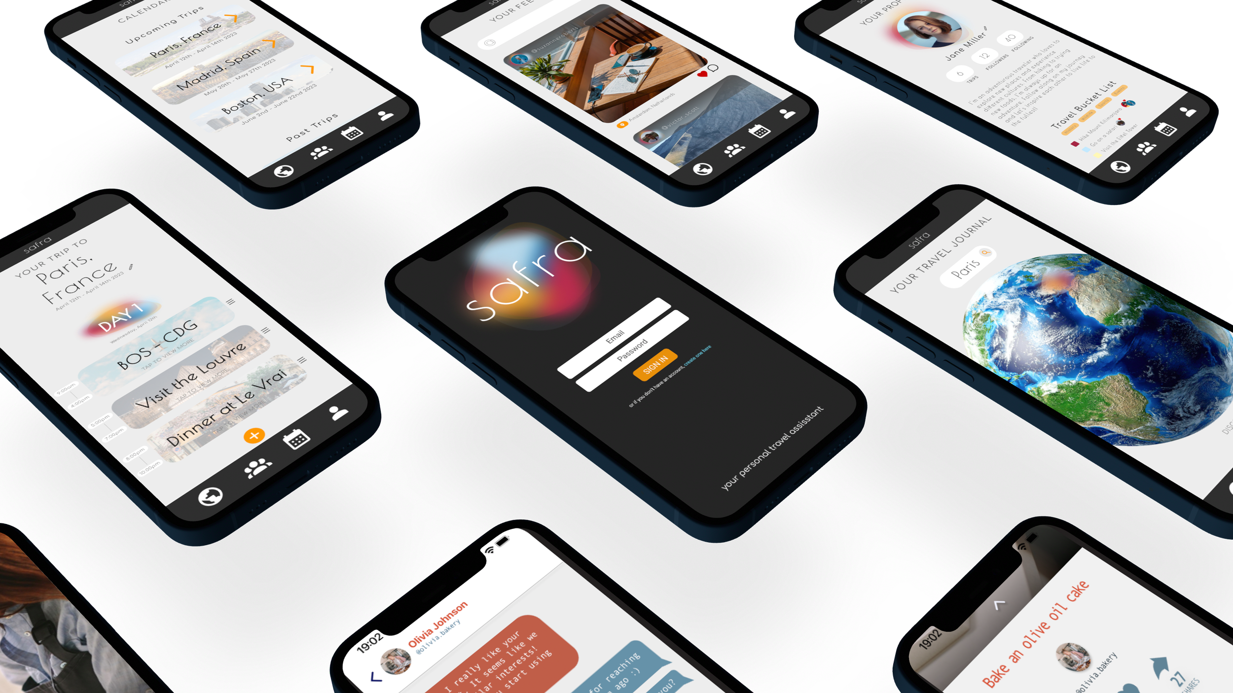
The user starts at the explore page in which they can search for any country/city they are interested in traveling to. The color blob can rotate around the globe for fun exploration or the search bar can be used. They can then start planning.
Users can access their past trips to refer back to previous plans, as well as their upcoming trips in order to add to their itinerary or just check.
Explore
Calendar
The plan page allows the user to add, delete, reorganize, or view plans. They can edit the dates and customize the hours for a planned item too.
Plan
Users also have a feed in which they can follow travel influencers and friends to get inspiration/recommendations or simply to keep up with people’s journeys.
Feed
The profile page allows users to interact with the community on the app. They can follow people as well as share their travel bucket list.
Profile
TEST
FUTURE DIRECTION
If I had more time, I would have conducted rigorous user research through interviews, task analysis, and comparative analysis in order to gather valuable insights. I would have also performed usability tests to get feedback on the designs and optimize the flow.
REFLECTIONS
I really enjoyed working on this project since it was mostly based on my creativity and my own experience. This is a concept I have been wanting to develop and working on this project gave me a feel of what it would look like if I were to pursue it further.
Wanna hop onto the next?
That’s the end of this project.


